6 Tips for Designing a Multilingual Mobile App for iOS
To achieve the broadest audience for your iOS app, it is key to support as many languages as possible. However, localisation comes with its complications, and requires some simple forethought to get the best user experience and maintainable solution.
Having written many iOS apps that support several languages, including right to left languages like Arabic, I’ve learnt some lessons the hard way. I often see fellow developers struggle to build flexibility that caters for multilingual nuances; therefore I’ve put together a selection of best practice tips when designing a multilingual app. You’re welcome.
1. Plan for it
Even if your app does not need additional languages in the first version, you may decide to add a language later on, so it’s worth putting in a little more effort up front. Trust me, coming back to engineer it all later is very, very painful.
2. Consider the layout
At the design stage, when you’re laying out your screens, avoid focusing on a single language. Consider how a language like German, for example, could break the design.
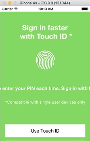
Note the title ‘Sign in faster with Touch ID*’ text fits in English

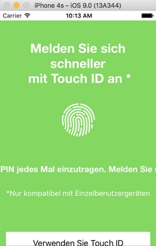
Now replace this with German and the whole view blows up! 😖

While you want to do everything; exactly match the screen designs and keep the design team happy, you’ve got to remain pragmatic. It’s worth working with the UX team during the design phase to help influence the design choices.
In summary you should:
- Use 0 lines for UILabels. Don’t specify the number of lines. This will allow more verbose languages to spill correctly and not truncate, hiding important text.
- Set limits for the width of UILabels using leading and trailing space. Do not set limits on the height, because long text will tend to go offscreen left and right if you don’t.
- Build your constraints to let the content flow correctly: anchoring the important parts, and perhaps using proportional layouts, and expanding whitespace.
- Name your controls with meaningful but content independent names, like ‘TitleLabel’, instead of what the content is. i.e. ‘SignInFasterWithTouchLabel’. This will help mentally separate layout from content, mainly because your content will be different in another language, but it also clarifies your intentions and your code.
3. Tools and Defaults
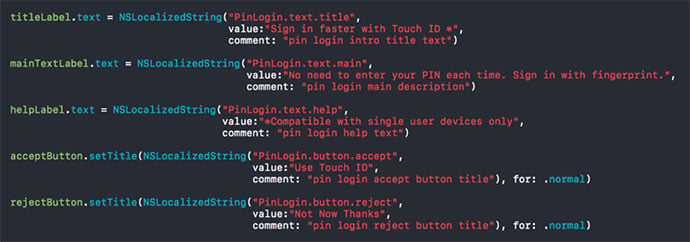
Write the initial translations in the code. This is for two reasons;
- Firstly, all strings will have a default value even if a translation is missing, or the localization strings file has not been created.
- Secondly, when the localization file is generated, the extra information provided will be a great help to your translation team. They will really value the comments in order to get the correct meaning for translation.
However, be sure to use the correct methods:
Use:

Instead of:
And then use a tool for generating the Localizable.strings file, one that will put new translations at the start or the end of the file would be ideal, so you can see what strings are new, and what strings will need fresh translations in the other languages.
And hopefully your generated Localizable.strings file will look something like this...

4. Use Fewer Localizable Files
You could localise the storyboards and the xibs, but this creates lots more Localizable.strings files, which complicates getting translations completed thoroughly, and tracking changes. Instead, a better idea is to reference each control in code and apply translations there.
While this creates a little extra work up front, chances are, you will probably be referencing the control anyway to set other properties. It also ensures that translations are thought about by you, the developer. Of course not all strings are on screen initially, some may be alternative text, and these need to be catered for too.
Use key names and comments in code to help your translation team understand what you mean:

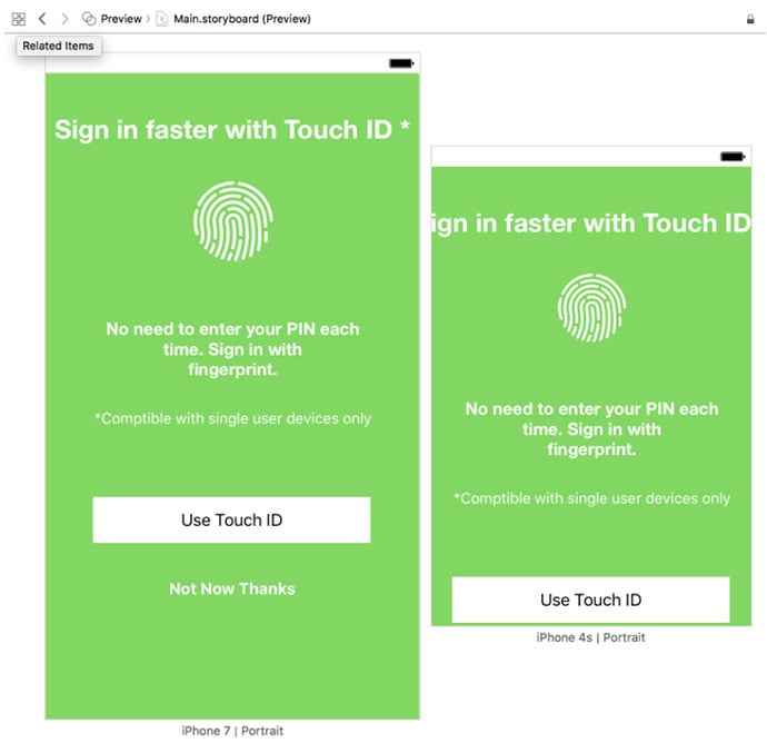
5. Use the Assistant Editor to Preview the screens
Preview the screen with the Assistant Editor. Select the Preview mode, and add screens for the smallest and largest device you are catering for. I would normally use an iPhone 4s, and an iPhone 7 Plus preview.

6. Test it!
It may seem obvious, but if it was, then why do so many developers not do it?
Test it with the Double Pseudolanguage to find the places you have missed. Edit your current scheme, and in the options pane, set the Application Language to Double Length Pseudolanguage, and then run up the app on a device because this is more representative.
Your screens will now look somewhat mangled, but hopefully if your layout has been done well, it should handle it. If not, it will highlight areas that need attention.
Finally, test it on a device, in the languages you support! Again, seems obvious, but it is the only way to get it right, and that is what you need to do. So do it…
Conclusion
Managing a multilingual app can be pretty tricky. It’s also time consuming to build. But thinking about it, when you cut the first lines of code, is always the best way to produce a consistent UI with a great UX.
And hopefully, with these brief tips you can produce something that does not go floppy when you change the language. Happiness.
Need to make some changes to your app? Or update and maintain it? Find out how much it'll cost in your free app development cost breakdown!
John Green
Related Posts
Got a project? Let's work together
Compsoft is a remote working company except for Thursdays when we work together from the Alton Maltings in Alton, Hampshire (UK). Our registered address is detailed below. We'd be delighted to have either a virtual chat with you or to make arrangements to meet in person.
