Photoshop caught me cheating with XD, and I don't care
Having been in the Design industry for many years, I have grown up with Adobe products, and I am still a big fan of them. Photoshop has been my trusty go to application for almost everything I do when designing for mobile apps. Starting with Photoshop 4.0 in 1996, and upgrading to almost all versions since then, we have become great friends - soul mates even (as much as flesh and blood can bond with binary).
Photoshop is familiar, comforting and, dare I say it, fun to use on a daily basis. I can find my way around its familiar UI quickly, and efficiently produce designs that met… aw, who am I kidding?….exceeded customers expectations ;).
My loyalty to Photoshop, however, has started to wane of late and my eye has started to wander, taking in the smooth lines of the new appealing applications popping up across the design industry marketing themselves as the next best thing and the future of mobile design.
But the thought of moving away from Photoshop brought with it an air of apprehension - even to the point of giving me clammy hands and an irrational sense of guilt.
Then, last year, Adobe released its first public beta of Experience Design (XD). It is included in their Creative Cloud subscription and I immediately installed it with the intention of jumping onboard face first - but it came at the time where projects were flooding in and time scales and budgets getting tighter. There never seemed to be the right time to abandon Photoshop and take the plunge and begin my journey with Adobe XD.
However the nagging sense that there was something better had been planted and in the end, I threw caution to the wind and used it on a couple of smaller projects.
My betrayal was complete and I just didn’t care.

I quickly started to realise how powerful this relatively new application from Adobe is and the potential it has to be the next industry standard and go-to platform in mobile app design. Yes, even to the point of replacing the lovely Photoshop…
Here are just a few ways Adobe XD is making my life easier.
1. Interactive prototypes
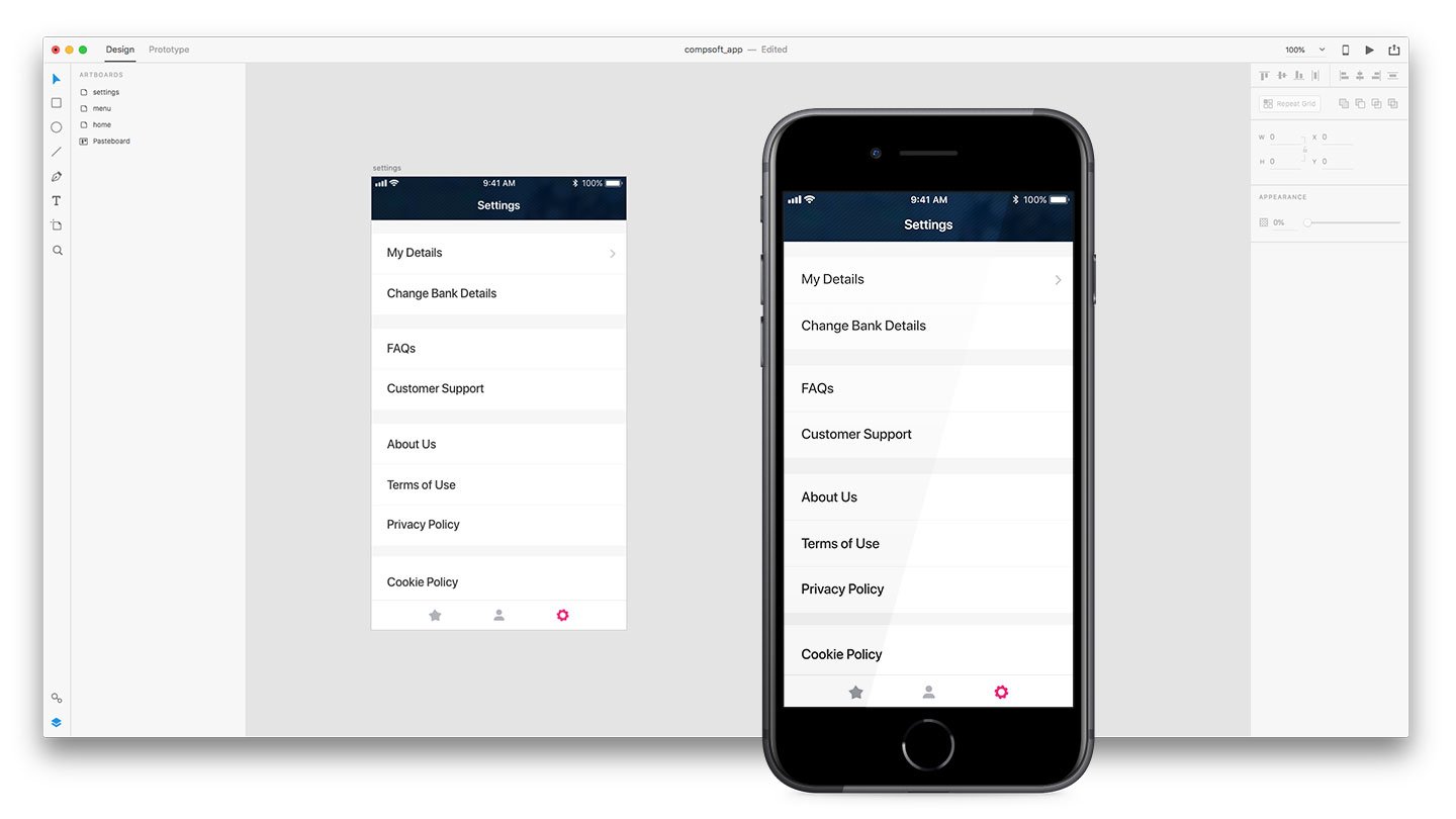
XD is ridiculously fast and easy to use. It’s a single application that provides features to wireframe, design, prototype, and more.
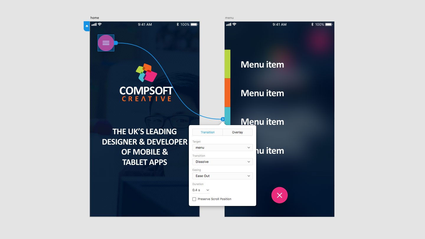
The prototyping feature is super efficient. Simply link one screen or an item within a screen to another and chose a transition style. That’s it, prototype finished!
When using Photoshop I would export all the screens as individual files then upload and stitch them together using something like Marvel App.
XD removes these steps and when you’re ready to present you can then either share your interactive prototype online with someone who doesn’t have XD or view it direct on a device with the Adobe XD app.
There are a number of features where the prototype feature falls short such as limited screen transitions and the ability to import videos/gifs to mimic custom animations but I’m certain those features will be available in the near future.

2. Live device previews
The ability to view designs on device is a must have tool for any UI designer. There are times where we spend hours working on a single screen, tweaking font weights and sizes, colours and whitespace until it looks just right on a large desktop display.
But it’s not until the design is viewed on an actual device and in your hands do you get a real feel for if it looks the way you intended in the real world.
Until recently, Photoshop allowed you to view your designs on your phone using a separate app - however it was always a little sluggish and buggy and I found myself getting increasingly frustrated with it. Tellingly, this functionality was removed from the October 2017 release of Photoshop CC.
Adobe XD does have an app (even more of a sign Adobe is staking its investment for app design in XD). The Adobe XD app is on iPhone and Android and unlike the Photoshop version it is awesome. It has made previewing designs on device a seamless, enjoyable experience, a vital tool I now use on every project.

3. Repeat grid
Creating lists and table views in Photoshop could regularly be a time consuming task. Copy and pasting common components and manually filling the screen with dummy content and just when you think you have the perfect solution, you realise you need to add an extra column or UI element into each cell :-0.
Adobe XD’s repeat grid feature not only allows you to create one item, and repeat it as often as you like, you can also make adjustments to one of these items updating them all at the same time. And what's more, you can drag and drop images and text documents onto your repeat grid and they automatically populate your repeat grid. Awesome!
4. File sizes
I like to have all my screen designs in one place (one file), so I can quickly compare screens and duplicate common elements easily. But with the advancement in device sizes and screen resolutions it doesn’t take long for your PSD files to reach hundreds of megabytes, or gigabytes in some cases.
Even when working at base sizes (non-retina for iOS and MDPI for Android) it results in sluggish workflows, impacting project efficiency and my own sanity.
Adobe XD has blown this out of the water. The average size of my XD files is around 3-5mb resulting in a very fast and responsive program that is a dream for both myself and my previously overworked Macbook Pro to use on a daily basis.
Even though Adobe XD is relatively new, having only been announced as out of beta in October 2017, the reception has been really good. I sit in awe of its lightweight yet powerful and extremely intuitive capabilities. There is clearly a lot more work required by Adobe to bring it up to speed and supersede its more established competitors such as Sketch.
The Adobe XD Feedback : Feature Requests & Bugs blog gives you the opportunity to review existing and submit your own feature requests and upvote favourite suggestions so the tool is community driven.
So I am afraid to say I have turned my back on my old friend Photoshop… It pains me more than it does Photoshop - I would love to say it's my fault not Photoshop’s, but it’s not… Photoshop is old and out of step (at least in terms of designing for mobile) than the younger, smarter products.
Adobe XD is my new love and I do get that ‘butterfly thrill’ every time I load her it up.
If you want us to help you with your app - do get in touch we're ready to help!
Gary Kendall
Related Posts
Got a project? Let's work together
Compsoft is a remote working company except for Thursdays when we work together from the Alton Maltings in Alton, Hampshire (UK). Our registered address is detailed below. We'd be delighted to have either a virtual chat with you or to make arrangements to meet in person.
